
This shows how much I pay attention to other band's CDs, but the cover for the Kings Of Leon album, Aha Shake Heartbreak...
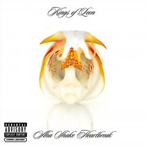
Looks an awful lot like...
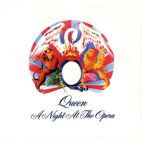
A Night At The Opera. At the very least, it uses a similar font.
Although the cover for Escape The Fate's self-titled album...
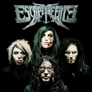
Intentionally looks like...
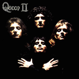
Queen II.
In this interview, Max Green of ETF says "I wanted something that was bold and made a statement, but didn't want anything too flashy. I didn't want something that said "We are selling out, we signed to a major label," so this is what I came up with."
So... he went with the concept for Queen II (which, by the way...
I tend to look down upon this shit because it, to me, shows a lack of creativity or effort. Not that I'm the most creative person on the planet, but I'd like to think I'm above taking iconic concepts from relatively recent popular culture and making them my own. But really, I guess I shouldn't expect too much from Escape The Fate. I haven't even heard of them until yesterday, but their lyrics are worse than the shit I used to write in school.
I've tried finding out more about the Kings Of Leon cover, but Google failed me.
No comments:
Post a Comment